Role: Product Designer
Duration: 4 Weeks
🚧 The Challenges
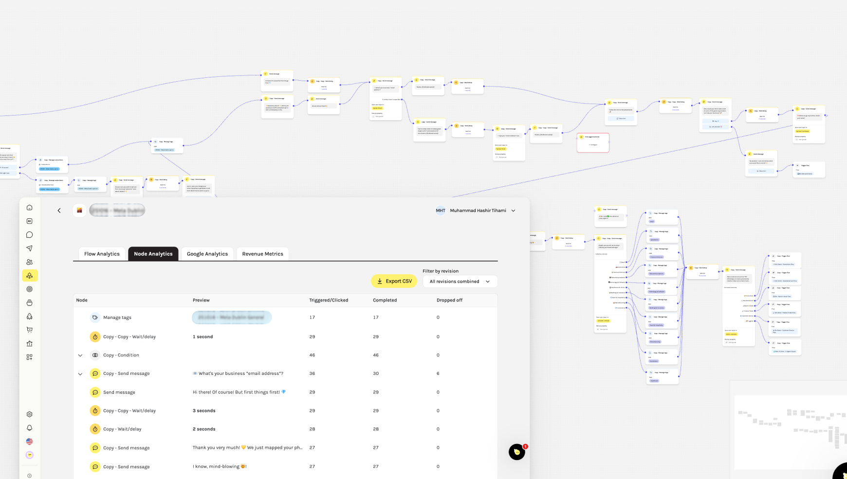
Before this project, analytics in Journeys existed outside the Flowbuilder, forcing users to switch screens and interpret disconnected data tables. This made debugging and optimization slow, unclear, and frustrating for marketers.
🎯 Impact
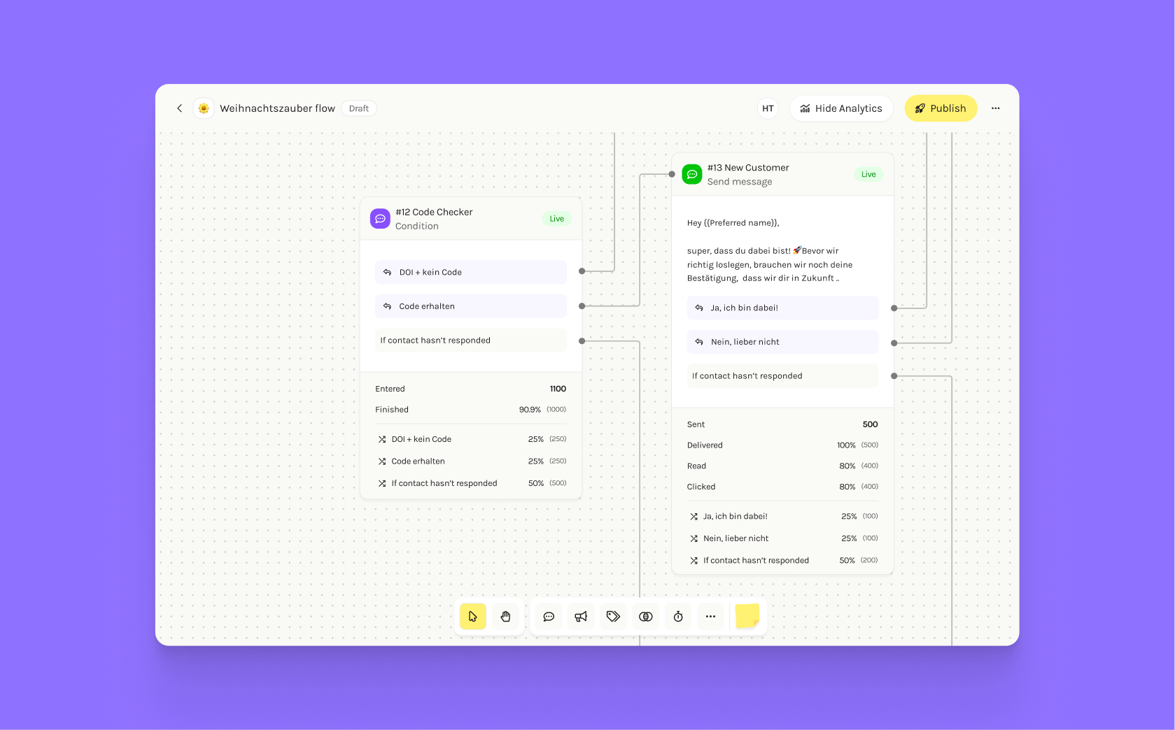
The new on-canvas analytics fundamentally improved how marketers used Journeys at Charles. By bringing data directly onto the Flowbuilder, I helped users gain immediate visibility into message performance and flow behavior.
- Significant increase in conversion rates: More end-users completed intended actions (like purchases or sign-ups) as marketers could identify and improve weak points in their flows.
-
Reduced Support Tickets: Marketers can now debug and fix issues without CSM assistance.
-
Greater Autonomy: Users can compare message performance directly, eliminating back-and-forth with support.
-
Improved Optimization: Clearer insights led to faster iteration and better-performing flows.
The Process
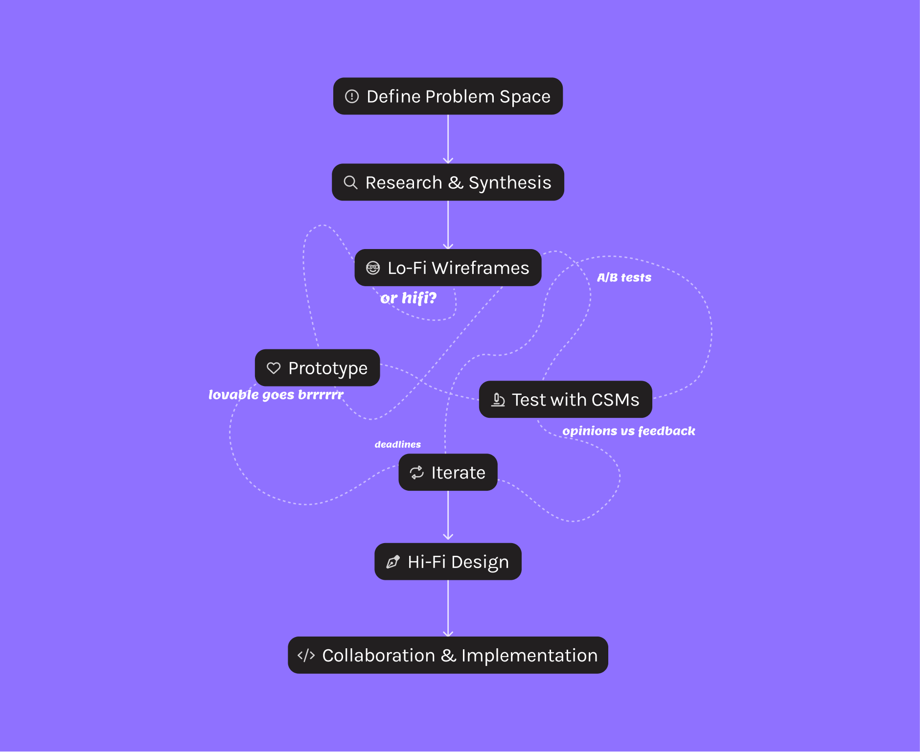
Designing analytics for Flowbuilder wasn’t just about adding numbers. It was about bringing clarity and confidence to marketers who were flying blind in their own automations.
1. Spotting the Signals
We knew something was off when:
- CSMs were flooded with questions about performance metrics.
-
NPS scores dropped due to frustration around flow debugging.
-
Support tickets kept piling up for “Why is my flow not working?”
These insights confirmed we had a visibility problem as users couldn’t see what was happening inside their flows.
2. Mapping the Problem Space
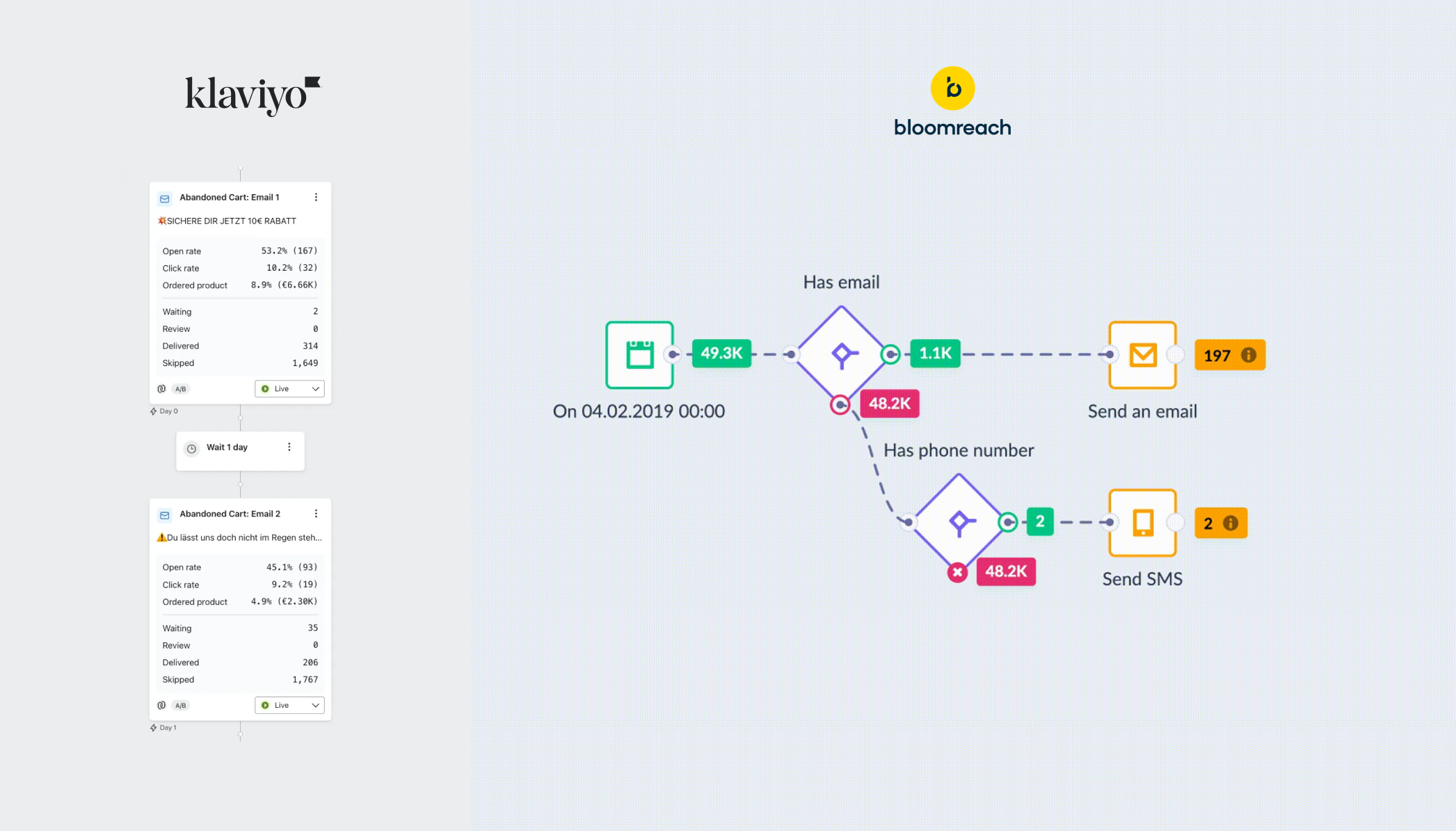
To understand the root causes, I:
- Gathered feedback directly from CSMs and marketers.
- Lots of competitive research showed how tools like Klaviyo and Bloomreach have such powerful analytics features. But they both offered different things. Node analytics and flow analyitcs were still kept in different frames.
-
Identified two core pain points: debugging issues and lack of performance visibility.
-
Outlined design goals to make analytics feel part of the flow, not an external report.
3. Rapid Prototyping & Iteration
Speed was critical, therefore I used Lovable to quickly prototype iterations in three directions:
- Table-first layout: Canvas preview on top, detailed analytics below.
-
Overlay design: Analytics displayed on top of the canvas to save engineering time.
-
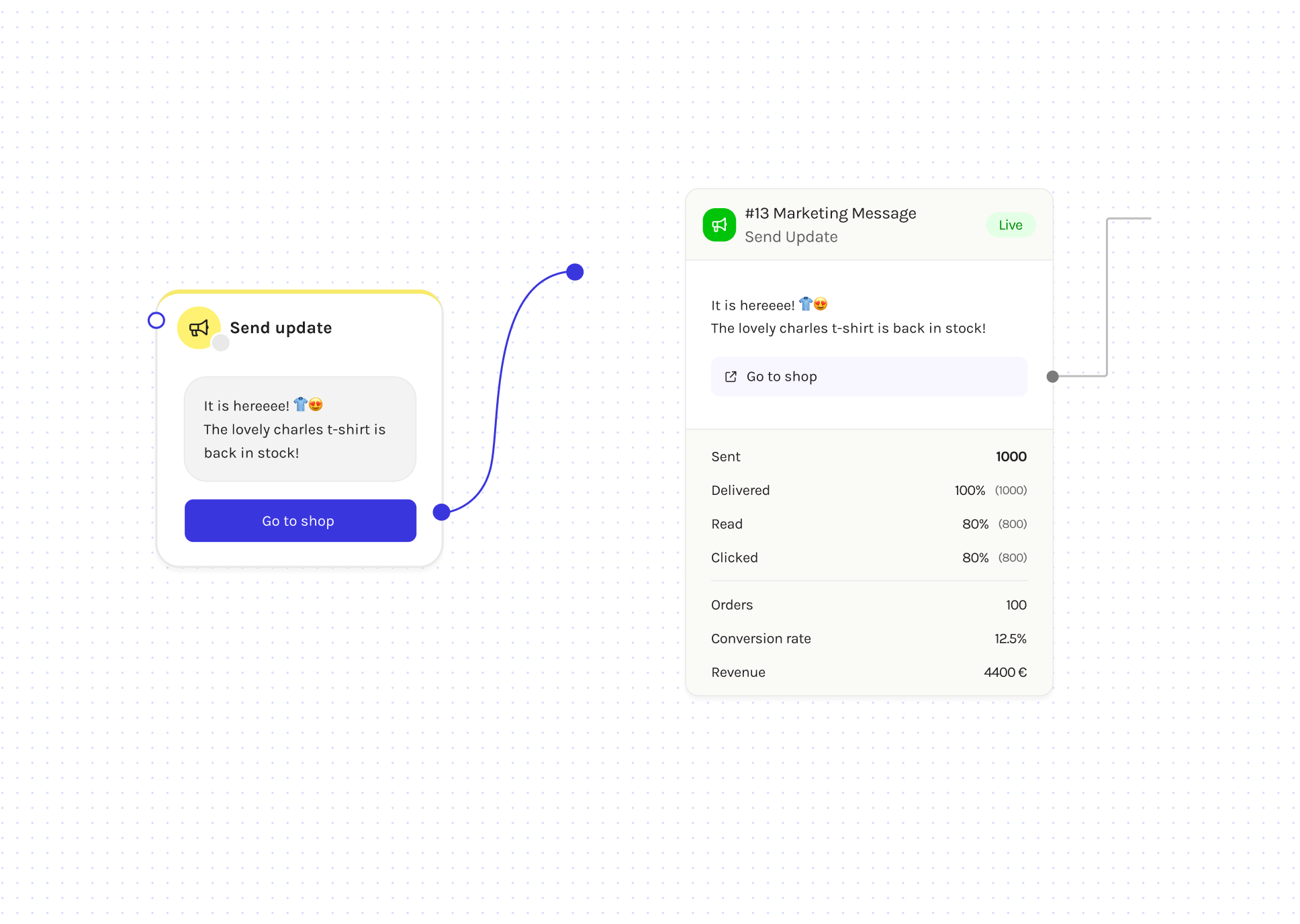
Inline panel design: Analytics revealed directly inside nodes when users clicked Show analytics.
After testing these with CSMs and internal teams, the inline panel version won by far. It offered context without clutter and fit naturally into users’ workflows.
4. Tackling Real-World Constraints
Designing for real customer data meant thinking at scale. Many customers edited live flows without publishing their changes, causing mismatches between the canvas and the live version. We aimed to fix this and make Flowbuilder more reliable for large-scale use. Key refinements included:
-
Node IDs: Added unique node identifiers in headers for easier reference across other Charles tools (like audience segments).
-
Elbow connectors: Replaced the old bezier curves with right-angle lines, making flows look cleaner and easier to label.
-
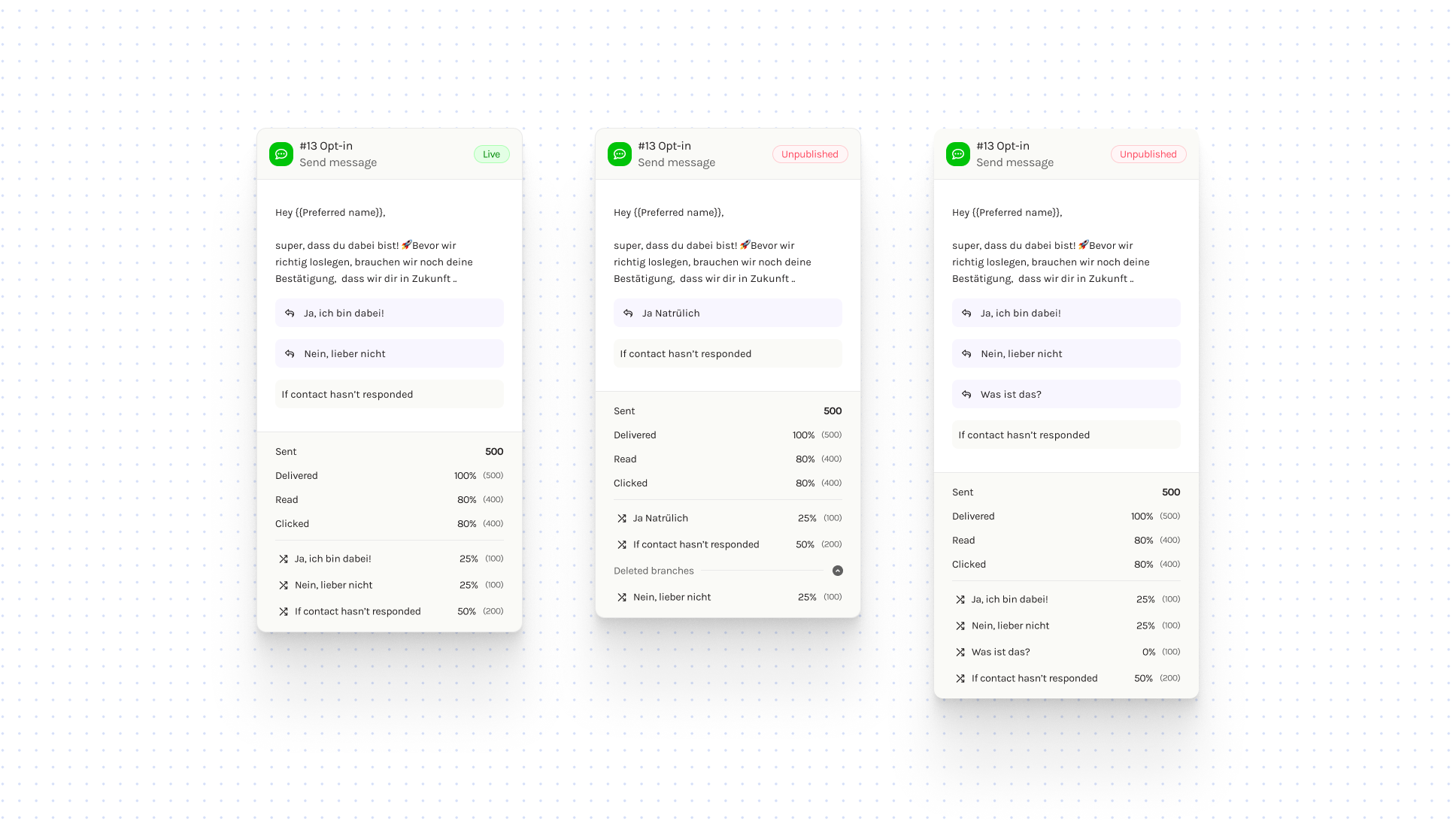
Bringing transparency to live edits: Another challenge we solved was helping users keep track of unpublished changes in live flows. Previously, many users weren’t sure whether the edits they made to a node were already live. To fix this, we added clear “Live” and “Unpublished” tags in the node header. Now, whenever a user updates a node, the “Unpublished” tag instantly appears, making it clear that their changes aren’t live yet and that the analytics might not reflect those updates.
5. Refining the Node Experience
While solving analytics, we also took the opportunity to clean up the visual system:
-
Unified node header structure across all node types.
-
Added a dedicated name line so users could rename nodes while still seeing their type.
-
Defined a color-coded system for better visual grouping (green for WhatsApp messaging, purple for logic, etc.).
-
Fixed a long-standing duplication issue where “–copy” tags stacked endlessly — now it adds only once, keeping the canvas readable and professional.
6. Collaboration & Implementation
With limited frontend resources, I jumped in hands-on:
-
Worked closely with engineers to adapt the node component for analytics.
-
Used GitHub Copilot to make UI tweaks directly — creating a branch and PR for faster iteration.
-
Defined clear component variants and prop-based conditions to keep the design scalable and maintainable.
This collaboration helped us ship faster without compromising on design integrity.
Explore more case studies
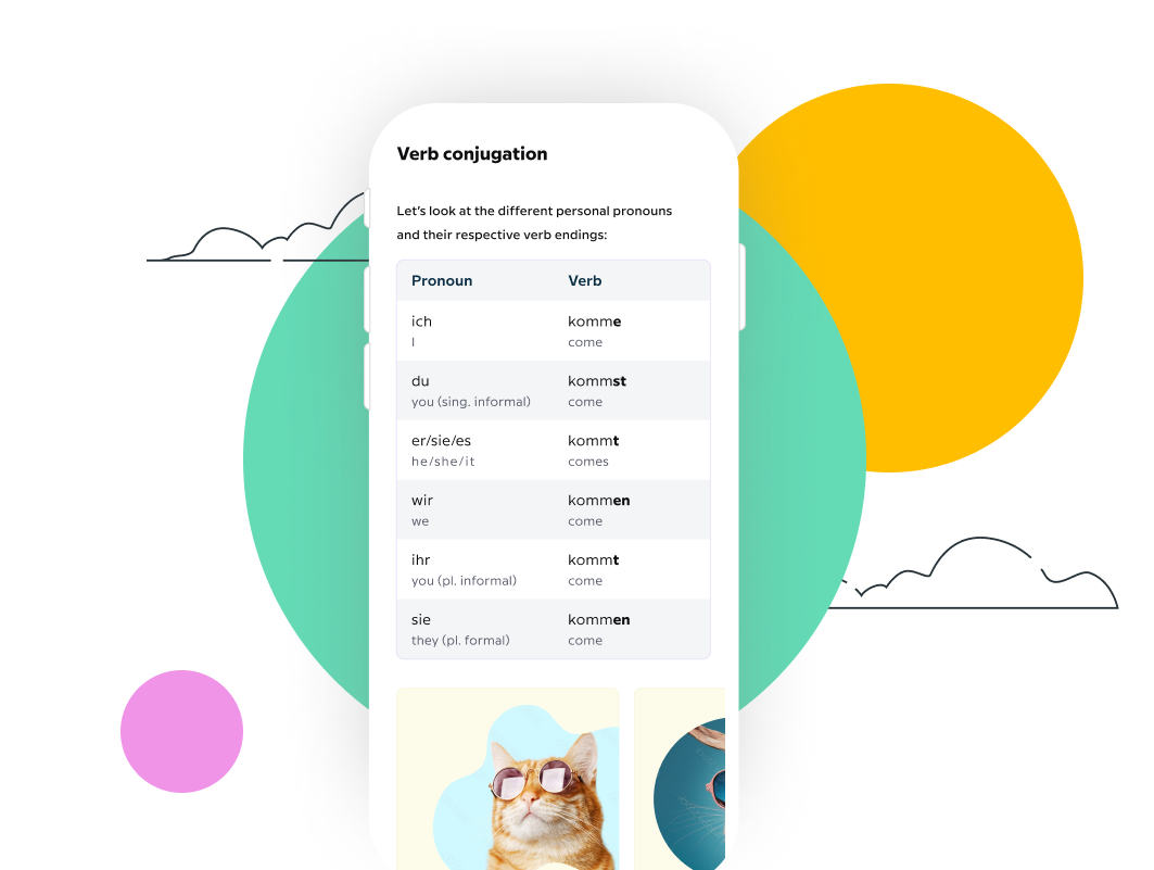
Grammar Guide Case study
This case study showcases my journey from concept to successful implementation of Grammar Guide
